IoT & AI

B2B

Repositioning an AI startup from corporate IT to accessible B2B brand

Client

Neonify

Neonify

Model

Product accelerator

Product accelerator

Neonify dashboard showing welcome screen with template shortcuts for Blog Post, Landing Page, Social Post, Email and Product Description, recent content table and recent campaigns table

Services

Product strategy

Product strategy

UX/UI design

UX/UI design

Rapid prototyping

Rapid prototyping

Product optimisation

Product optimisation

Info

Neonify's corporate-IT branding was undercutting it with the creators and marketers it needed to win, in a market projected to reach $200B by 2028. We repositioned it from corporate IT to an accessible B2B brand, then redesigned the product around that decision across a 16-week phased accelerator.
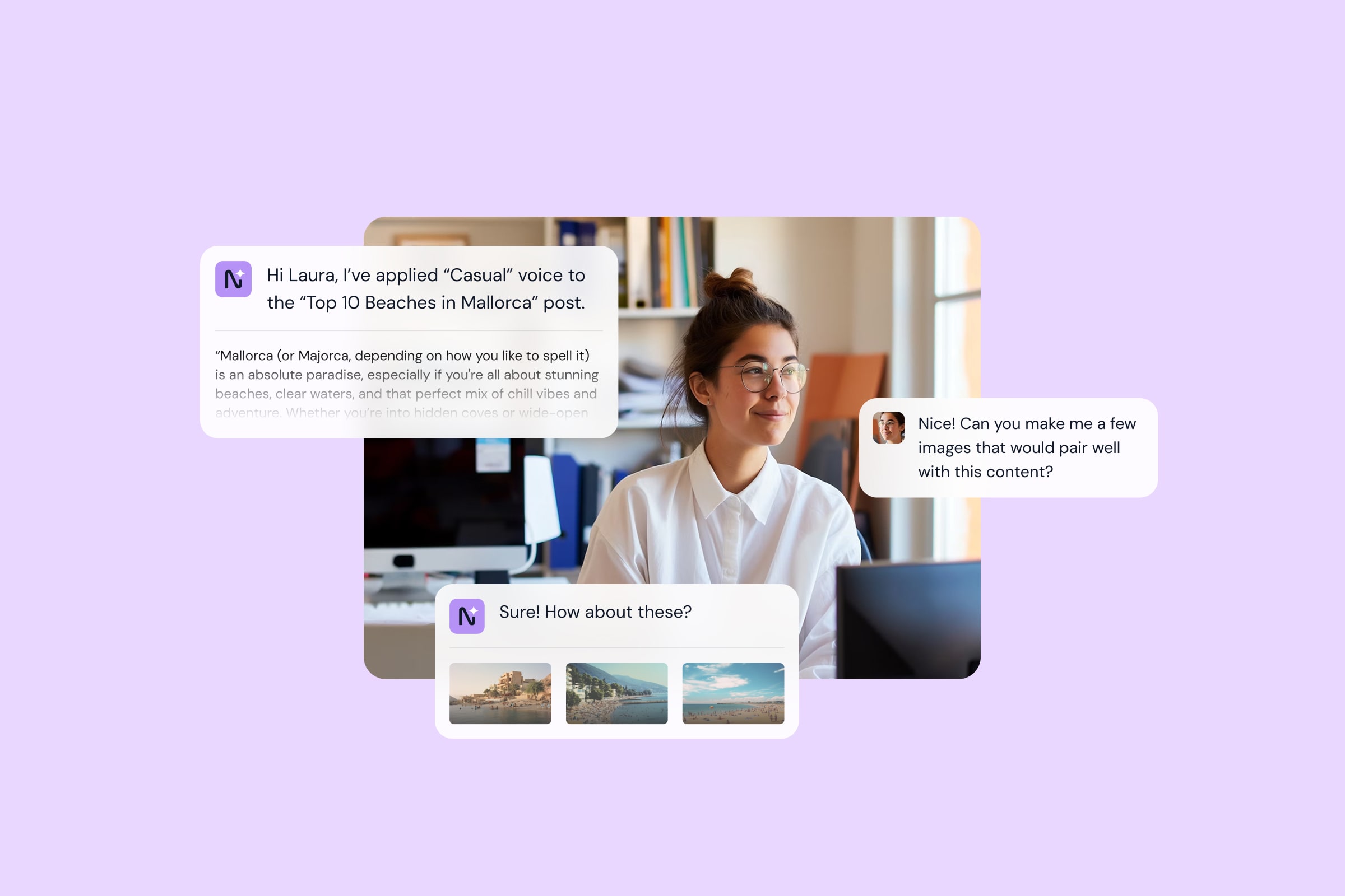
Content creator at desk with Neonify AI chat bubbles showing brand voice application, content generation and image suggestions for a Mallorca beaches blog post
Neonify wordmark logo with sparkle accent on lavender background
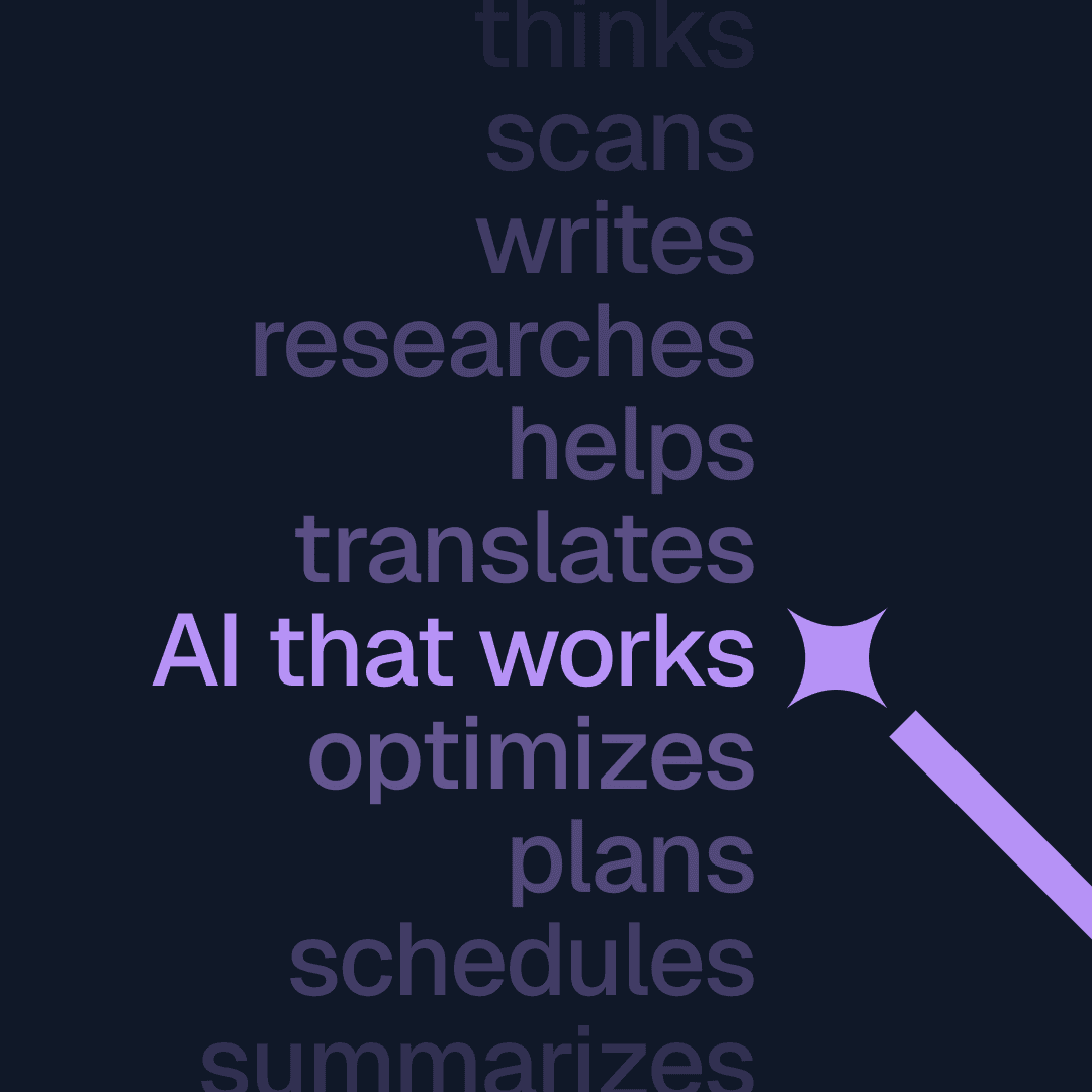
Neonify brand graphic listing AI capabilities including thinks, scans, writes, researches, helps, translates, optimises, plans, schedules and summarises with magic wand sparkle icon on dark background
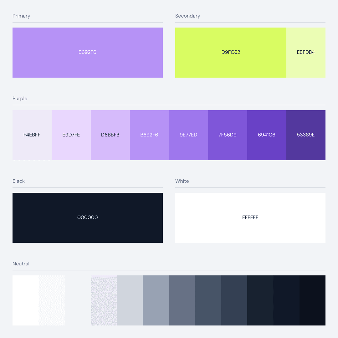
Neonify colour palette showing primary purple, secondary lime green, purple scale from light to dark, black, white and neutral grey tones with hex values
Neonify app icon with stylised N lettermark in purple and lime sparkle on dark rounded square, set on purple background
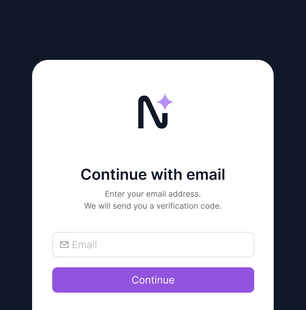
Neonify email login screen with logo, email input field and purple Continue button on dark background
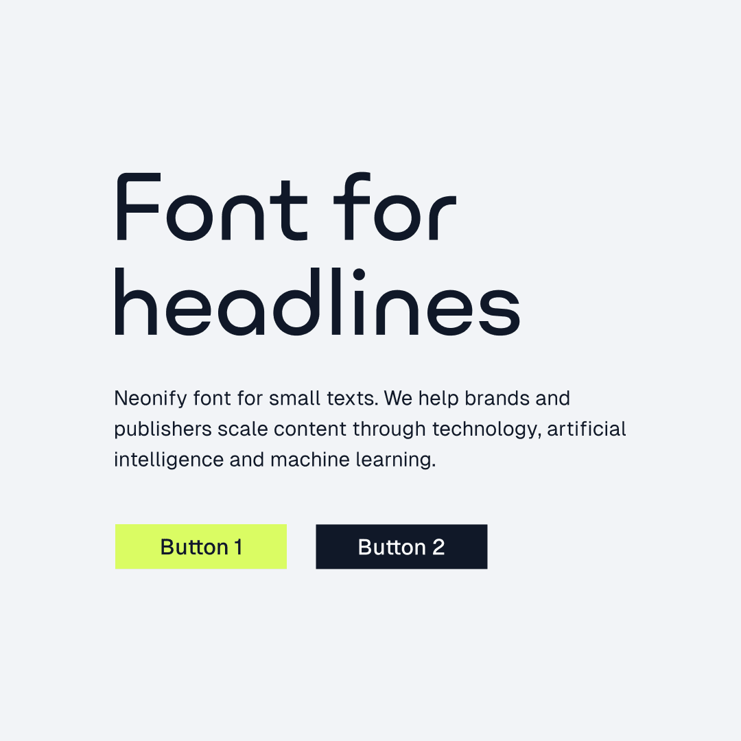
Neonify typography specimen showing headline and body font styles with lime and dark button variants

Challenge

Neonify's challenge reflects wider market dynamics: only 25% of companies move beyond AI proof-of-concept. Technical positioning creates barriers in markets where accessibility drives success. In short, sophisticated capabilities mean nothing if users don't feel the product is for them.

Our analysis

Technical capability alone doesn't win; startups succeed when brand credibility backs up product quality. So the decision was to reposition first, then redesign the product around it: a two-phase accelerator, brand then product UI, with an in-house period to make it market-ready.
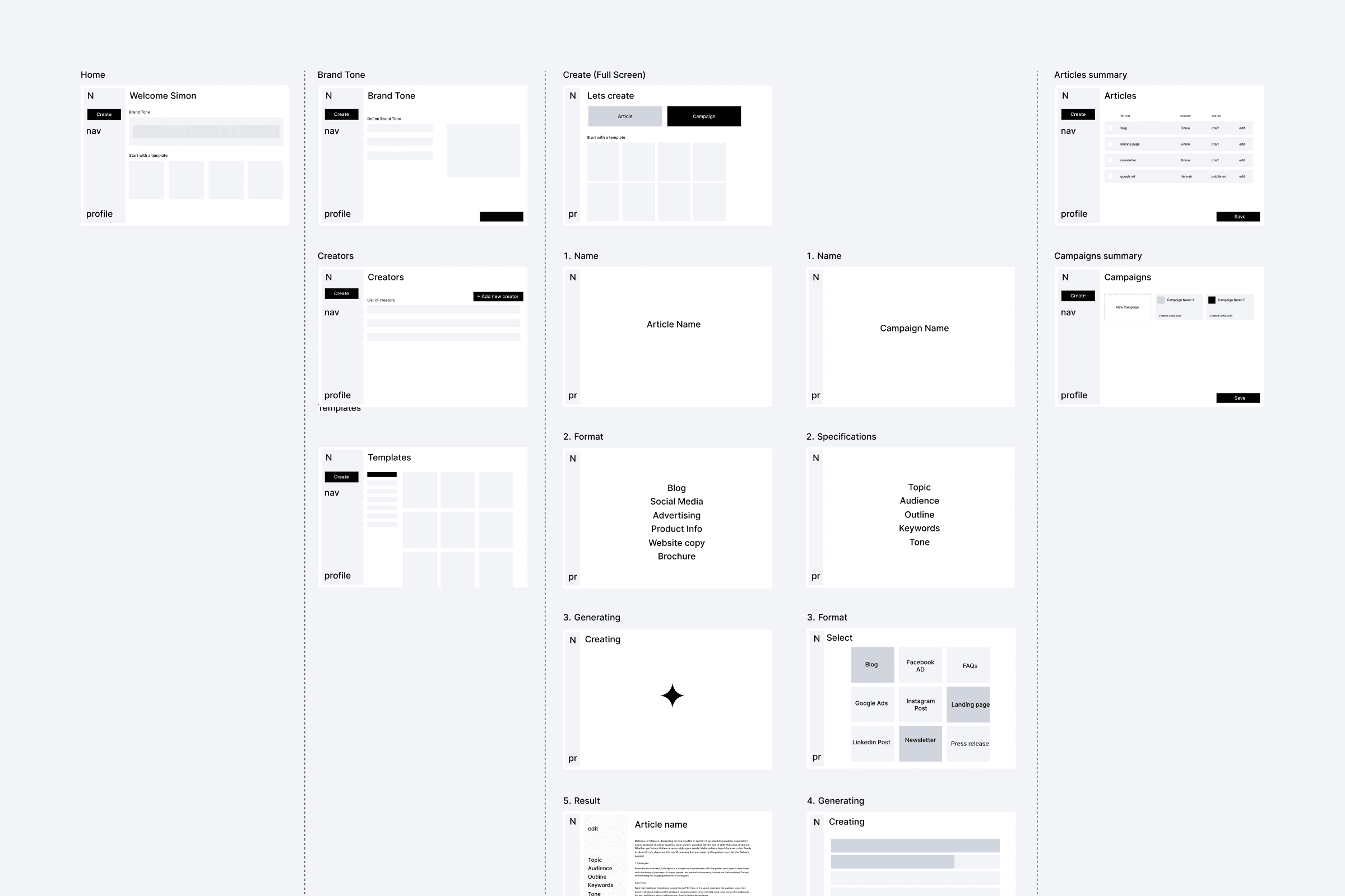
Neonify wireframe sitemap showing user flows for Home, Brand Tone, Create, Articles, Campaigns, Creators and Templates screens with content generation steps
Neonify templates screen showing content type selection grid with Home Page, Newsletter, Blog Short, Blog Long, Instagram and Landing Page options with category filters in sidebar
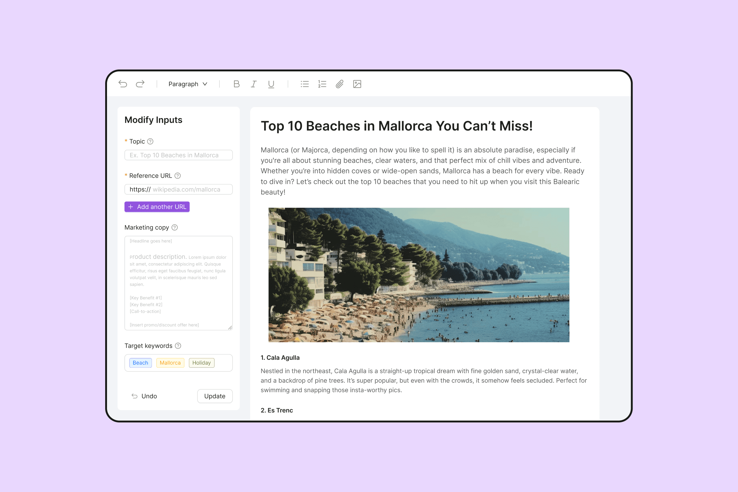
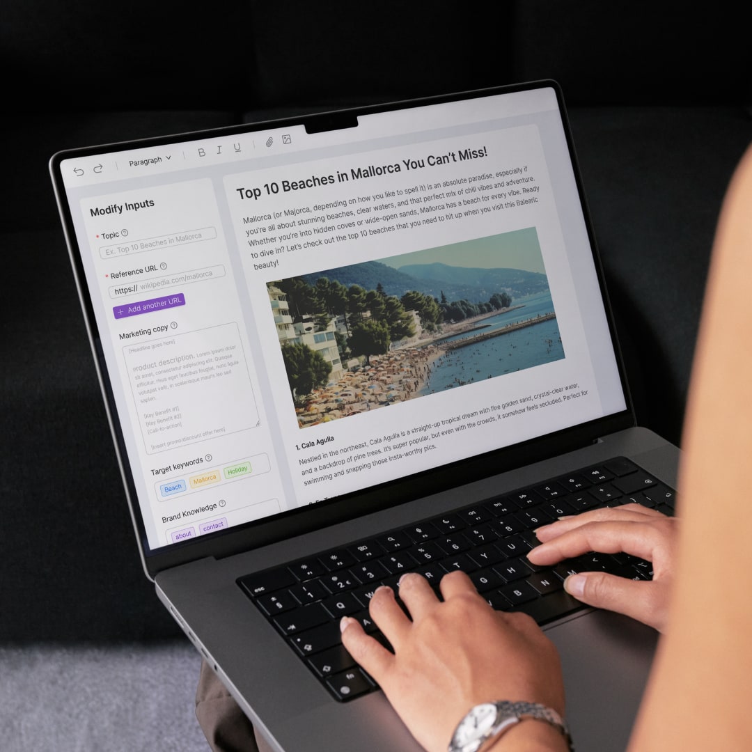
Neonify article editor with input panel on left for topic, reference URL, marketing copy and target keywords, and generated blog content about Mallorca beaches on right with rich text toolbar

What we did

01.

Repositioned the brand

Complete visual identity overhaul: a modern wordmark, playful star motif, and calming purple palette. New website with benefits-focused messaging replacing technical specifications. High-fidelity prototypes made Neonify appear market-ready before development completion.

Repositioned the brand

Complete visual identity overhaul: a modern wordmark, playful star motif, and calming purple palette. New website with benefits-focused messaging replacing technical specifications. High-fidelity prototypes made Neonify appear market-ready before development completion.

02.

Product UI redesign

Redesigned core product interface to match new brand identity. Clean, consumer-grade UI replaced analytics-heavy dashboard styling. Component library created for consistent application across the platform, making AI capabilities feel approachable for agencies and creative teams.

Product UI redesign

Redesigned core product interface to match new brand identity. Clean, consumer-grade UI replaced analytics-heavy dashboard styling. Component library created for consistent application across the platform, making AI capabilities feel approachable for agencies and creative teams.

03.

Market validation through rapid prototyping

Build-to-think approach enabled stakeholder alignment and user testing while development continued. Market positioning validated through user-ready designs without full product completion.

Market validation through rapid prototyping

Build-to-think approach enabled stakeholder alignment and user testing while development continued. Market positioning validated through user-ready designs without full product completion.

04.

Compressed delivery timeline

Three phases delivered the whole programme in 16 weeks, repositioning Neonify from corporate IT to an accessible B2B brand.

Compressed delivery timeline

Three phases delivered the whole programme in 16 weeks, repositioning Neonify from corporate IT to an accessible B2B brand.

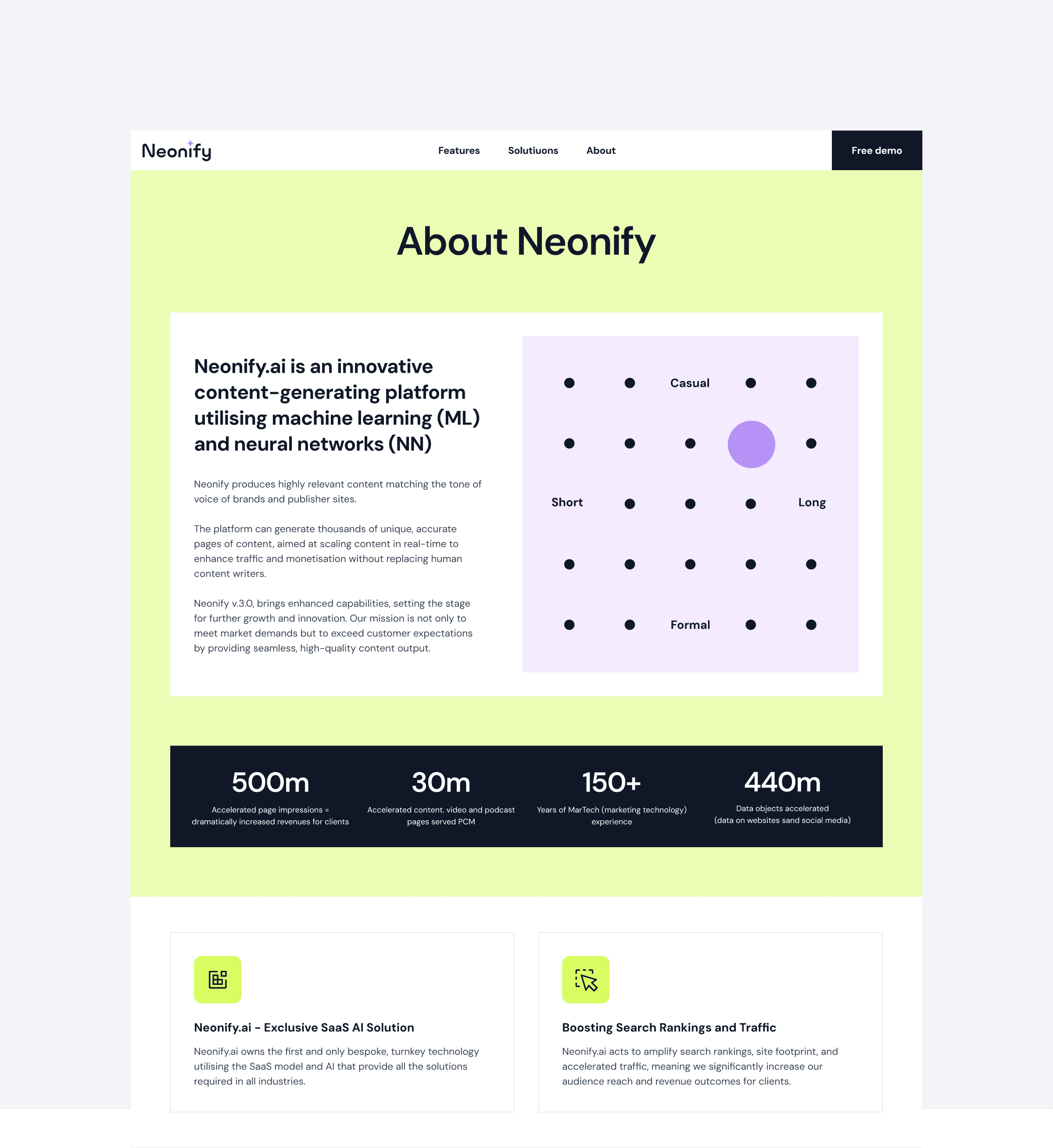
Neonify about page showing platform description, tone and length control matrix, key stats (500m impressions, 30m pages, 150+ years experience, 440m data objects) and feature cards
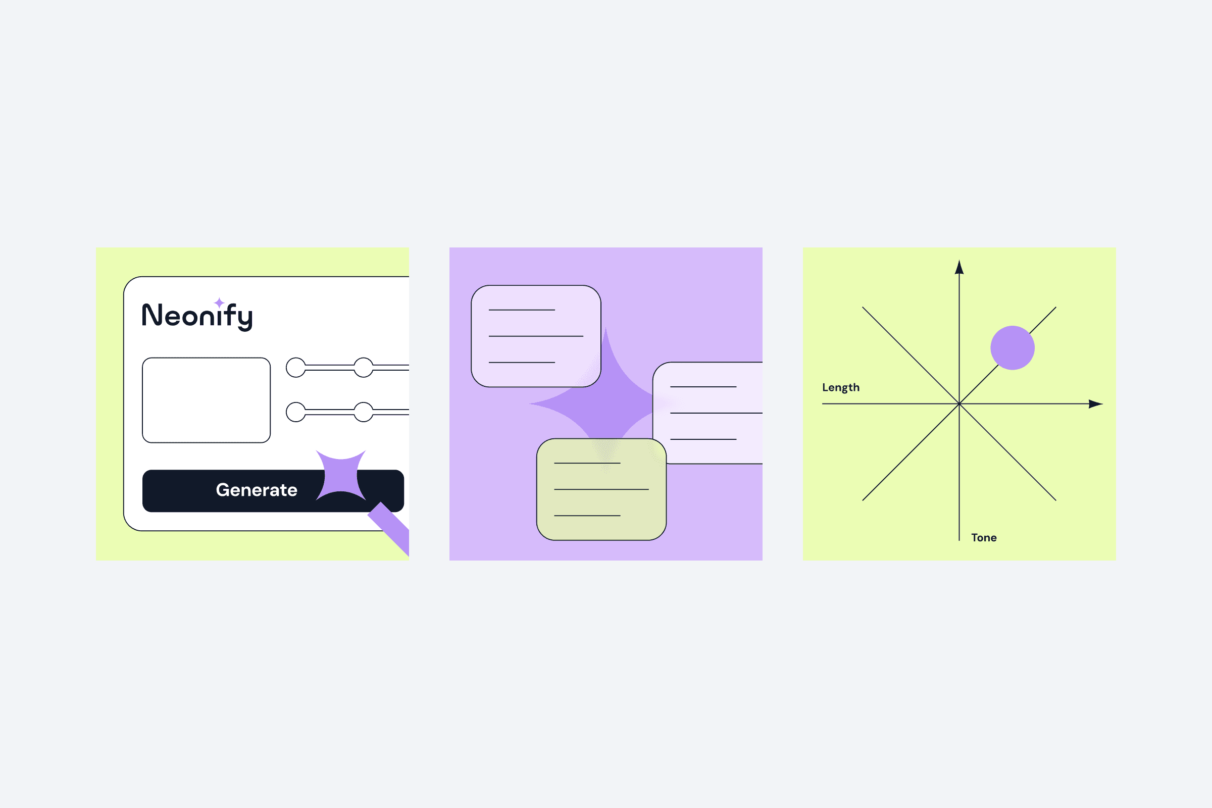
Three Neonify feature illustrations: content generation interface with Generate button, AI-powered multi-format output, and tone-length calibration axis diagram
Laptop showing Neonify article editor with input controls for topic, reference URL, marketing copy, target keywords and brand knowledge on left, and generated Mallorca beaches blog content with beach photo on right
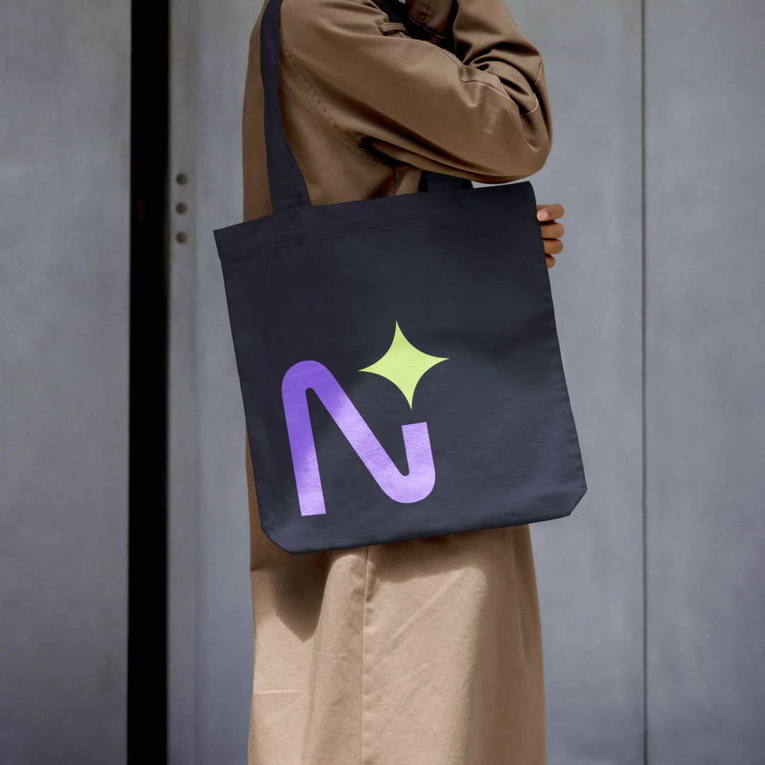
Dark navy tote bag with Neonify N logomark in purple gradient and lime sparkle

Project impact

A market position that fits its buyers

Visual identity now appeals to ideal customer profile of agencies and creative teams, strengthening product-market fit.

A market position that fits its buyers

Visual identity now appeals to ideal customer profile of agencies and creative teams, strengthening product-market fit.

Development risk reduced

High-fidelity prototypes enabled user testing and stakeholder buy-in before full development, reducing the risk of costly rebuilds.

Development risk reduced

High-fidelity prototypes enabled user testing and stakeholder buy-in before full development, reducing the risk of costly rebuilds.

A brand the team can maintain in-house

Component library and brand guidelines enable internal team to maintain visual consistency across all touchpoints without external dependency.

A brand the team can maintain in-house

Component library and brand guidelines enable internal team to maintain visual consistency across all touchpoints without external dependency.

Ready to know what's worth building before you commit to it?

In a short, evidence-led sprint we help you decide, then design it.

For Neonify that was a reposition and redesign across a 16-week phased accelerator, with a brand system the team can maintain.

Let's talk about running one on your challenge.